Footer
Functionality
The footer is always shown at the bottom of the form, below the current page. By default, a hint regarding required fields and a logo is shown. Please note that each form can have at most one footer.
Base properties
Basic settings for Base properties
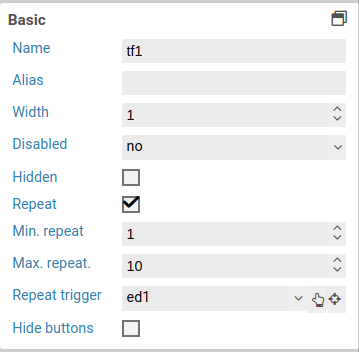
The base properties name, width and hidden can be set for each form field.
Base properties
| Name | Description |
|---|---|
| element | 6.3.0+ Element type of the form field. The element type can be changed by selecting another element type in the dropdown menu. The element types an element can be transformed into depend on the original type. Containers and fieldsets can only be transformed into the respective other element type. All other element types can be transformed into any other type, except for containers and fieldsets. |
| name | Name of the form field. Only letters and numbers may be used. |
| alias | An alternative name for the form element, which may contain any characters. See below. |
| width | Width of the form, relative to the width of other form fields on the same row. For example, when placing two form fields next to each, giving both a width of 2 means that both will take 50% of the available width. Setting the width of the first form field to 1, and the width of the second one to 3 results in the first one taking 25% of the available width, and the second one taking 75%. |
| hidden | When checked, the form field will be hidden initially. To show it again, the option visible if can be used, or a Javascript function such as jQuery.fn.visible. |
| disabled | When checked, the content of the form field cannot be edited. |
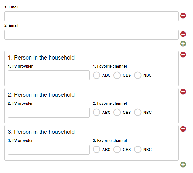
| Repeat | When this option is activated, the user can freely create any number of copies (repetitions) of this form element. For example, this can be used to let the user enter one or multiple email addresses. Please note that you cannot nest repeated elements: if a container is marked as repeated, none of its containing elements can be repeated. |
| Min. repeat | Minimum number of allowed repetitions. When this limit is reached, the user cannot delete any more repeated elements. This is also the inital number of repetitions when the form is opened. |
| Max. repeat | Maximum number of allowed repetitions. When this limit is reached, the user cannot add any more repeated elements. |
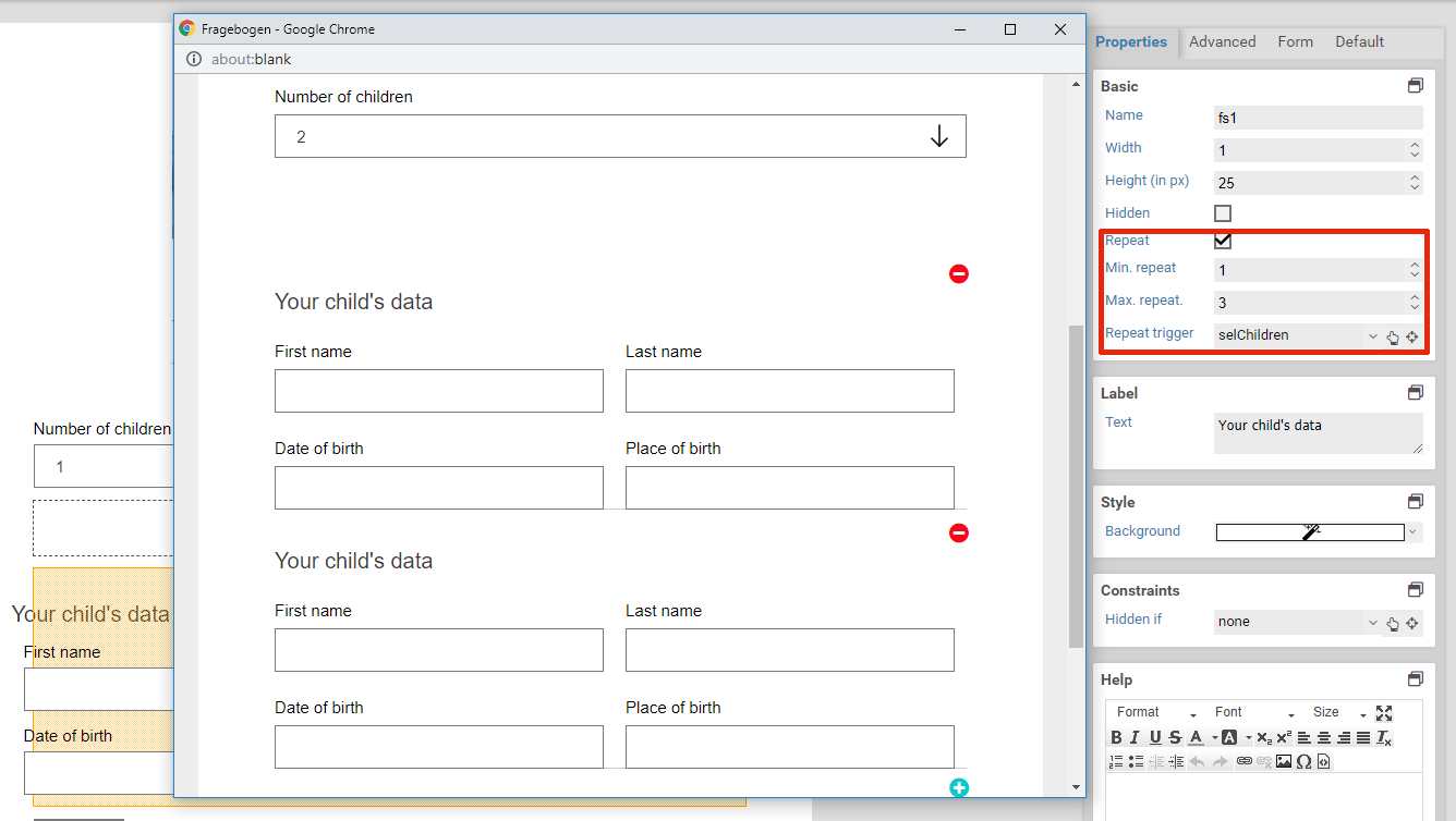
| Repeat trigger | When an element is selected here: The number of repeated elements is automatically set to the value of the selected element. For example: Assume there is a select element or input element that lets the user enter number of children in their household. Also assume there is a fieldset for entering some data of these children. The fieldset is marked as repeated, and the select or input element is set as the repetition trigger. Now when the user enters how many children they have got, fieldsets are removed or created automatically so that there is always one fieldset for each child. |
| Hide buttons | 6.2.0+ Available only when an element was selected for Repeat trigger. Enable this option to hide the plus and minus buttons for adding and removing repeated elements. Use this option when the number of repeated elements should be controlled only by trigger. |
Alias
When a form is submitted, key-value pairs are sent with the name of the form being the key and the entered text being the value. Within workflow actions or templates, you can access the values of submitted form elements with variables. The name of a form element cannot contain special characters such as accented characters (é or ô). When sending data to web services or when integrating third party systems, it may become neccessary to make use of special characters. In this case, you can set an alias for a form element. This alias does not have any restrictions on which characters you can use.
This form elements does not possess any additional settings for the section Base properties.
Style
| Name | Description |
|---|---|
| Background | The background color of the footer. Defaults to transparent. |
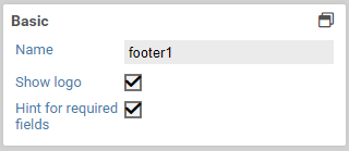
| Hint for required fields | When this is enabled, shows a notification regarding required fields and that they are marked with a star (*). |
| Show logo | When enabled, shows a Xima® Formcycle logo. |
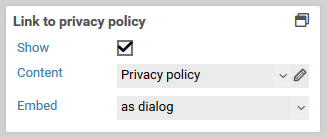
6.6.0+ Privacy policy
| Name | Description |
|---|---|
| Show | Whether a privacy policy should be displayed in the footer of the form. |
| Content | Selection of an HTML-Templates, which contains the privacy policy. |
| Embed | The privacy policy can be integrated as a dialog, as a new window or inline. If the option as dialog or as new window is selected, a link appears in the footer, which opens the selected HTML template in a dialog or new browser window. If the content of the HTML template is to be included directly at the end of the footer, then the option inline should be selected. |
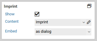
6.6.0+ Imprint
| Name | Description |
|---|---|
| Show | Whether an imprint should be displayed in the footer of the form. |
| Content | Selection of an HTML-Templates, which contains the imprint. |
| Embed | The imprint can be integrated as a dialog, as a new window or inline. If the option as dialog or as new window is selected, a link appears in the footer, which opens the selected HTML template in a dialog or new browser window. If the content of the HTML template is to be included directly at the end of the footer, then the option inline should be selected. |
