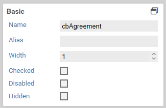
Checkbox
- Manage
- Copy
- Actions
- Export
- Print Preview
- Viewers
- Source
- Siblings
- Attachments (4)
- History
- Likes
Functionality
Form elements of type checkbox add a checkbox to the current form. The properties panel label allows you to add a descriptive label to the checkbox.
Base properties
Basic settings for Base properties
The base properties name, width and hidden can be set for each form field.
Base properties
| Name | Description |
|---|---|
| element | 6.3.0+ Element type of the form field. The element type can be changed by selecting another element type in the dropdown menu. The element types an element can be transformed into depend on the original type. Containers and fieldsets can only be transformed into the respective other element type. All other element types can be transformed into any other type, except for containers and fieldsets. |
| name | Name of the form field. Only letters and numbers may be used. |
| alias | An alternative name for the form element, which may contain any characters. See below. |
| width | Width of the form, relative to the width of other form fields on the same row. For example, when placing two form fields next to each, giving both a width of 2 means that both will take 50% of the available width. Setting the width of the first form field to 1, and the width of the second one to 3 results in the first one taking 25% of the available width, and the second one taking 75%. |
| hidden | When checked, the form field will be hidden initially. To show it again, the option visible if can be used, or a Javascript function such as jQuery.fn.visible. |
| disabled | When checked, the content of the form field cannot be edited. |
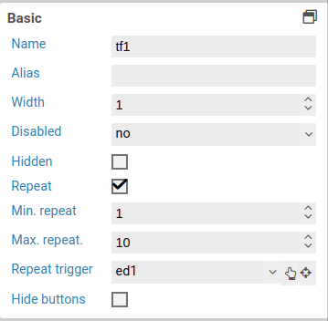
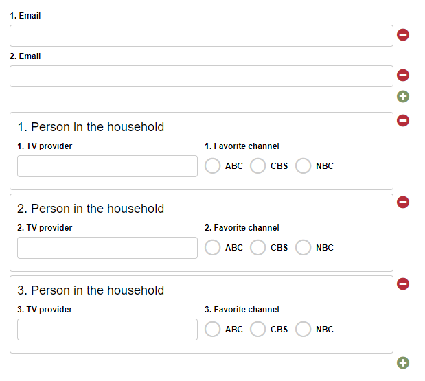
| Repeat | When this option is activated, the user can freely create any number of copies (repetitions) of this form element. For example, this can be used to let the user enter one or multiple email addresses. Please note that you cannot nest repeated elements: if a container is marked as repeated, none of its containing elements can be repeated. |
| Min. repeat | Minimum number of allowed repetitions. When this limit is reached, the user cannot delete any more repeated elements. This is also the inital number of repetitions when the form is opened. |
| Max. repeat | Maximum number of allowed repetitions. When this limit is reached, the user cannot add any more repeated elements. |
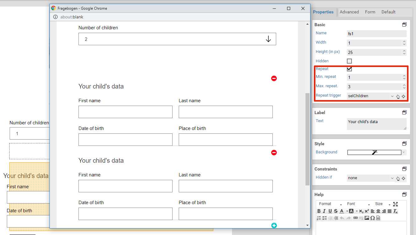
| Repeat trigger | When an element is selected here: The number of repeated elements is automatically set to the value of the selected element. For example: Assume there is a select element or input element that lets the user enter number of children in their household. Also assume there is a fieldset for entering some data of these children. The fieldset is marked as repeated, and the select or input element is set as the repetition trigger. Now when the user enters how many children they have got, fieldsets are removed or created automatically so that there is always one fieldset for each child. |
| Hide buttons | 6.2.0+ Available only when an element was selected for Repeat trigger. Enable this option to hide the plus and minus buttons for adding and removing repeated elements. Use this option when the number of repeated elements should be controlled only by trigger. |
Alias
When a form is submitted, key-value pairs are sent with the name of the form being the key and the entered text being the value. Within workflow actions or templates, you can access the values of submitted form elements with variables. The name of a form element cannot contain special characters such as accented characters (é or ô). When sending data to web services or when integrating third party systems, it may become neccessary to make use of special characters. In this case, you can set an alias for a form element. This alias does not have any restrictions on which characters you can use.
This form elements does not possess any additional settings for the section Base properties.
Constraints
Basic settings for Constraints
The constraints panel contains options to check the value of form fields, when form fields should be visible and when they can be edited. Some constraints are available only for some element, see the list of element..
Properties

| Name | Description |
|---|---|
| hidden if | Hides the form fieldm when a certain conditions is satisfied. |
| visible if | Makes a form field that has been hidden visible again, when a certain condition is satisfied. |
| read-only if | Locks a form field and disallows any input, when a certain condition is satisfied. |
| editable if | Make a form field that has been set to read-only editable again, when a certain condition is satisfied. |
| required | When this option is activated, a value must be entered for the form field. Conditions set under required if are ignored when this option is activated. |
| required if | Marks a form field as a required field, when a certain condition is satisfied. |
| required group | Available only when the form field is a required field. Specifies the required group the form field should belong to. When two or more form fields belong to the same group, at least one of these form fields needs to be filled out, all other fields may remain empty. |
Condition
You can change a form field's visibility and read-only state depending on the value of another form element. The following conditions are available for the options hidden if, visible if, read-only if, editable if, and required if:
- has a value
- has no value
- equals
- not equals
- lower than
- lower equal than
- greater than
- greater equal than
- between
- regular expression
| Condition | Description |
|---|---|
| has a value / has no value | The conditions evaluates to true when the value of the form field is (not) empty. In particular, having a value mean the following for different form elements:
|
| equals | The condition evaluates to true when the value of the form field equals the given value. Comparisons are case-sensitive. |
| not equals | The condition evaluates to true when the value of the form field does not equal the given value. Comparisons are case-sensitive. |
| lower than / lower or equal than | The condition evaluates to true when the value is lower (or equal) than the specified value. |
| greater than / greater or equal than | The condition evaluates to true when the value is greater (or equal) than the specified value. |
| between | The condition evaluates to true when the value is between the specified range, inclusively. The interval must be entered with a dash (-), for example 2-10. Negative numbers must be enclosed in parentheses, eg. (-10) - (- 5). |
| regexp | The condition evaluates to true when the value matches the specified regexp. |
Clear or reset automatically
For the properties hidden if and read-only if, you may choose whether the form field should be cleared or reset automatically when the form field ist hidden or disabled. Clearing a form field means that its value is removed, eg. deleting the entered text for an input field or unchecking all checkboxes for a select field. Resetting a form field, on the other hand, refers to changing its value back to the original or initial value it had when the form was openend. In case the form was opened for the first time and not submitted yet, the original value is the value as set in the Xima® Formcycle Designer. Otherwise, when the form was already submitted and is opened in the inbox, the original value is the most recently submitted (saved) value.
For example, consider the case of entering an address. The user can choose between a physical address and a post-office box, and only one input field is visible depending on the user's choice. When the form is submitted, a value should be send only for one of both fields. By selecting the empty automatically options, the input field post-office box will be cleared automatically when the user selects a physical address.
When an element is cleared or reset, all the elements it contains are cleared or reset as well. This applies to form elements of type page, container, and fieldset.
This form elements does not possess any additional settings for the section Constraints.
Label
Basic settings for Label
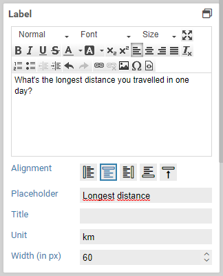
This property defines the label text of an element. A label is the text above, below or to the right or left of an element. Not every element has got this property.
| Name | Beschreibung |
|---|---|
| Label | Value of the label. This is the text that is displayed next to the element. |
| Alignment | Specifies the position (left, right, above, below) of the label. |
| Width (in px) | Distance between label and the element. Applies only when the alignment is set to left. |
| Placeholder | Placeholder text, applies only to input fields. |
| Title | Tooltip of the item (the HTML title attribute). |
| Unit | Text that after an element. Usually this is used for units, such EURO or km. |
This form elements does not possess any additional settings for the section Label.
Options
| Name | Description |
|---|---|
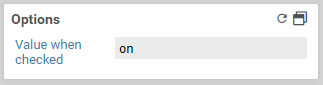
| Value when checked | The value that is sent to the server when the checkbox is checked and the form is submitted. |
Value
Basic settings for Value
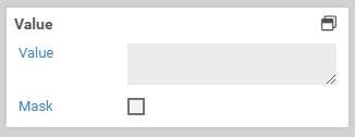
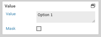
This property defines the initial value of the element. Depending on the selected item, there are different options to choose from. For more details on the value of particular elements, see the list of available form elements.
It is not possible to define initial values for "repeated" elements or elements that are in repeated containers in this way.
This form elements does not possess any additional settings for the section Value.
CSS classes
Basic settings for CSS classes
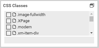
This property lets you select one or many CSS classes for an element. The available CSS classes are read from the CSS in the CSS tab and from the selected CSS theme. When you select or deselect a class, the changes are applied immediately and any layout or design changes are visible in the form. You can also filter the available classes by using the filter at the end of the list.
This form elements does not possess any additional settings for the section CSS classes.
Attributes
Basic settings for Attributes
The panel attributes lets you add custom attributes to the corresponding HTML elements of each form element. You can access them with JavaScript later, or add existing HTML attributes such as the attribute type for <input> elements.
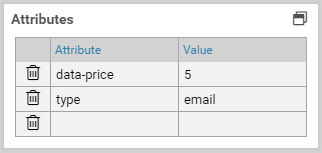
Adding an attribute
To add an HTML attribute, just enter the name and the value of the attribute into one of the columns. A new, empty column will be added automatically.
Deleting an attribute
Click on the icon to the left to delete an attribute.
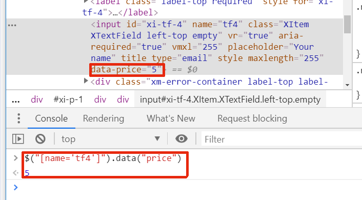
Accessing data attributes via JavaScript
If you want to add custom data to an element, use the prefix data- for the name. Additionally, the attribute name should contain no uppercase letters and use dashes to separate words. For example, data-serial-version is a good data attribute, dataSerialVersion is not. When accessing these attributes via JavaScript, remove the dashes and capitalize the first letter of each word.
Assuming the attribute data-serial-version was set to 1aFXc for the element tfSerialVer, you can access this data as follows:
console.log("Serial version is:" , serialVersion);
This form elements does not possess any additional settings for the section Attributes.
Available only if
Basic settings for Available only if
The property Available only if controls whether elements are displayed or not depending on the current state or user.
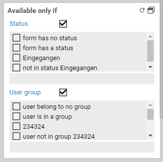
When only one state or a user group is selected, the form element is displayed only when the form is in the selected state or viewed by a user of the selected user group. For each state and user group there is also the opposite option to display a form element only when it is not in the selected state or not viewed by the selected user group. For example, when you want display a form element only when a user fills out the form for the first time, you can select the option no state.
If both a state and a user group are selected, the form element is displayed only when the form is both in the selected state as well as opened by a user belonging to one of the selected user groups.
This form elements does not possess any additional settings for the section Available only if.
Read-only if
Basic settings for Read-only if
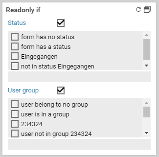
The property read-only if determines whether an element is read-only or not.
If only one state or one user group has been selected, the form field can only be filled out, clicked at, or selected when the form is not in the selected state, or the user currently signed in is not a member of this group. For each state and user group there is also the opposite option to make a form element read-only when it is not in the selected state or not viewed by the selected user group.
When both a state and a user group are selected, the form field item can only be filled out, clicked at, or selected when the form is both not in the selected state and the user currently signed in does not belong to the selected user group as well.
This form elements does not possess any additional settings for the section Read-only if.
Other
Basic settings for Other
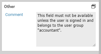
You can add a comment for internal use that will not appear anywhere in the form.
This form elements does not possess any additional settings for the section Other.

